


- Location
- Carabao Island, San Jose, Romblon, Philippines
- Project period
- 2026
- Services
- Website DesignWebsite DevelopmentOn-Page Seo
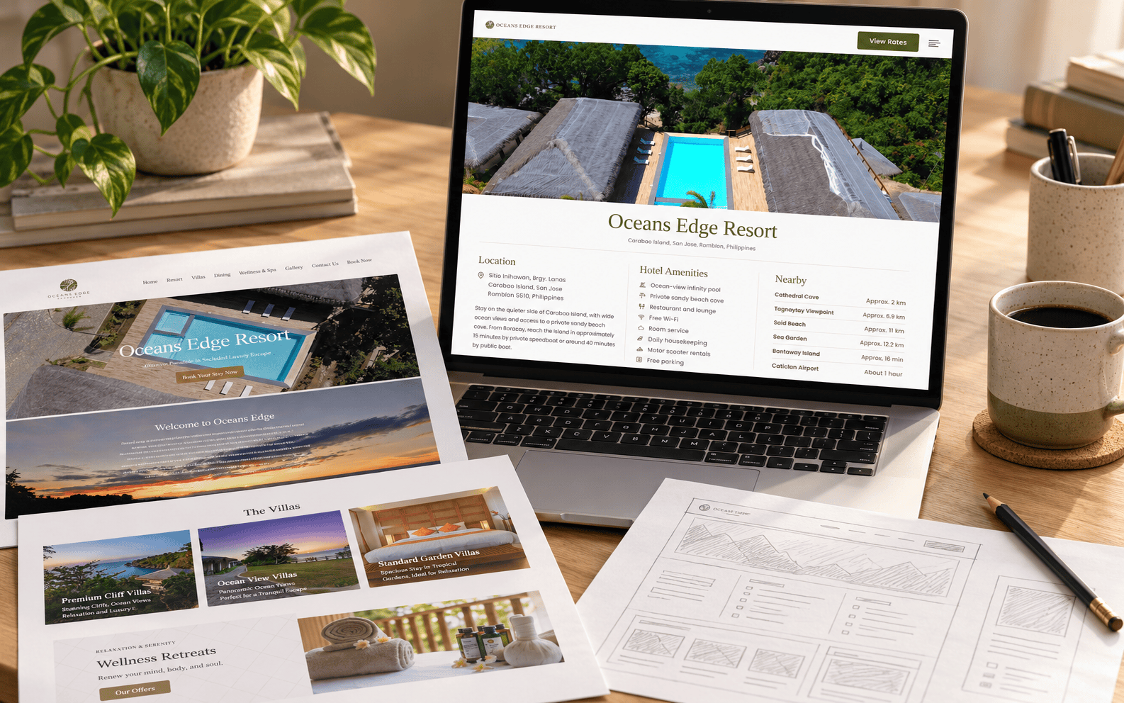
Oceans Edge Resort offers a quieter island escape on Carabao Island in San Jose, Romblon, with ocean-view villas, an infinity pool, and a private sandy beach cove.
Its website needed to introduce that experience while answering the practical questions guests ask before booking. OLWC brought those details into one connected page, consolidating repeated information and organizing the content around how people plan their stay.
The redesign also drew on our experience managing the resort’s advertising campaigns. Questions arriving through Facebook Messenger helped us understand what prospective guests needed to know and where the website could provide clearer answers.
Project Challenges
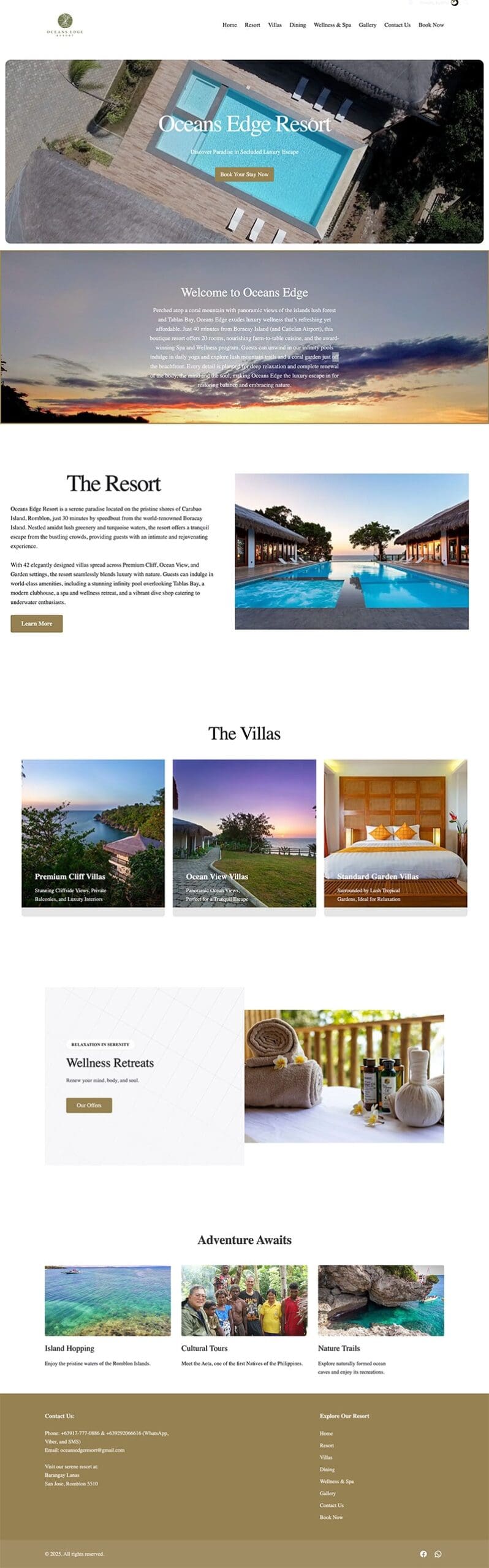
The previous website introduced Oceans Edge Resort through separate pages for the resort, villas, dining, wellness, gallery, and contact information.
Useful photographs and descriptions were already available, but visitors had to move between pages to build a fuller picture of their stay. Some information overlapped, creating an opportunity to simplify the structure and bring related details together.
The challenge was to create a compact website that still felt complete, giving the resort’s photography space while making essential information easier to find.
Project Objectives
Our goal was to create a welcoming website that reflects Oceans Edge Resort’s island setting and helps guests move confidently toward a direct reservation.
This meant presenting important information earlier, making villa details easier to compare, and keeping offers, travel information, and contact options within the same browsing experience.
The content needed to serve both visitors discovering the resort for the first time and guests returning to check a specific detail.
Our Approach
1. Bringing the Guest Journey Together
While managing the resort’s advertising campaigns, we paid attention to the questions guests asked through Oceans Edge Resort’s Facebook Page Messenger. Those conversations helped guide what the website needed to explain and which details deserved greater prominence.
“What are your amenities?”, “How to get to Oceans Edge Resort?”, “Do you have free transfers?”
Our developer’s hotelier background previously handling guest inquiries brought another perspective to that process. Directing people toward online reservations helped us consider the layout of the new website.
A question about room capacity can affect a family’s villa choice. A question about reaching the island can determine whether someone feels ready to book.
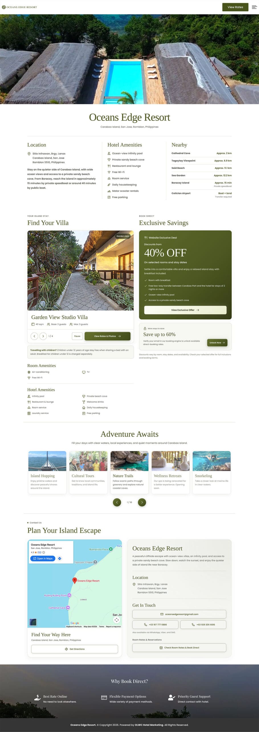
We used that understanding to organize the page into a natural sequence, connecting the resort introduction with accommodation, offers, activities, and practical travel information. Section navigation gives visitors a direct route to the details they need.
“Guest inquiries helped shape the new website.”
2. Refining the Resort’s Visual Identity
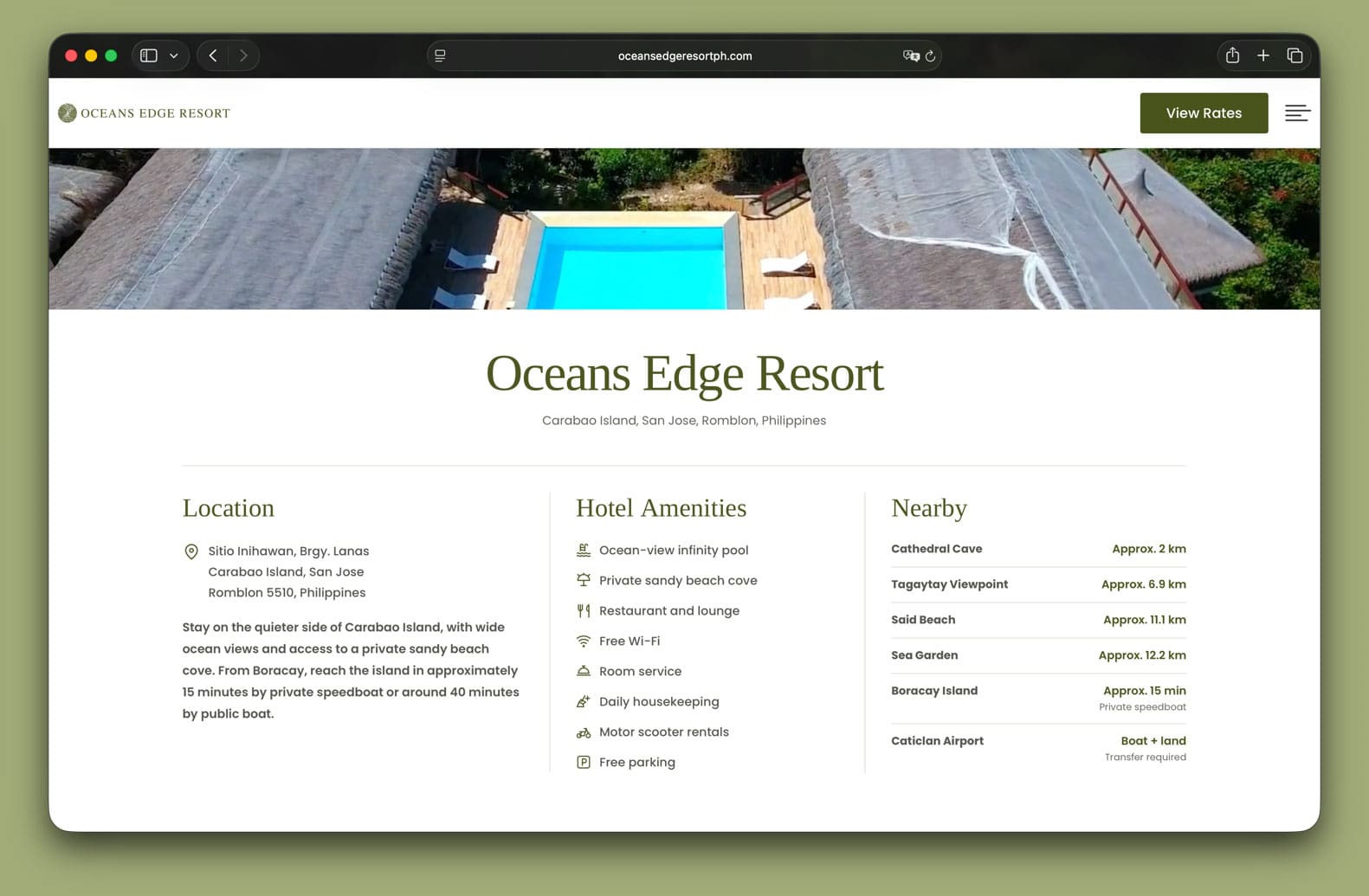
We built on Oceans Edge Resort’s existing logo and nature-inspired identity, using olive-green accents, light backgrounds, and consistent styling for buttons and information panels.
Large photographs introduce the setting, while clear headings and shorter descriptions organize the practical details around them.
The overview brings location, amenities, and nearby attractions into a structured presentation. This gives visitors an early understanding of the property before they explore the villas and booking offers.
3. Making Villa Information More Useful
The villa section needed to help guests make a choice as well as appreciate the accommodation.
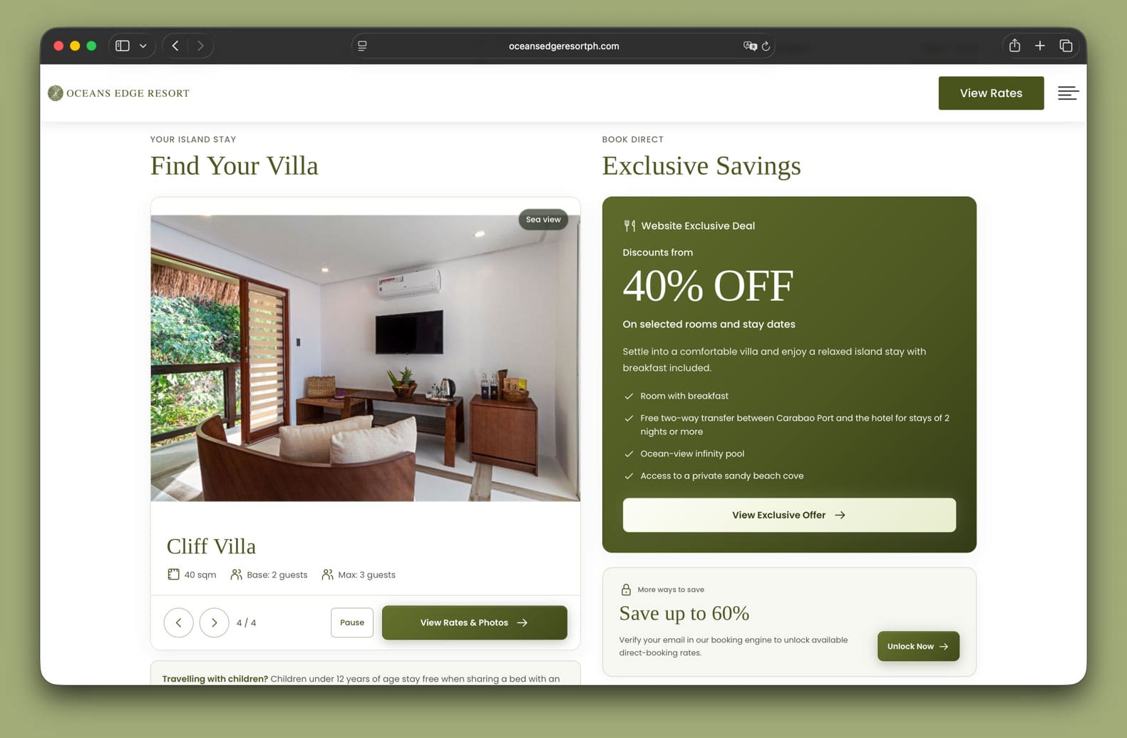
We developed a structured slider that brings the villa name, photographs, floor area, and guest capacity into one viewing area. Base and maximum occupancy help couples, families, and small groups understand which accommodation may suit them.
A nearby child-policy note provides information that can affect a family’s room selection. These are details a hotel team regularly explains during an inquiry, placed where guests are already considering their options.
The “View Rates & Photos” button provides a clear next step into the booking engine.
4. Giving Direct Booking Offers a Clear Hierarchy
We positioned the offers beside the villa section so guests can consider accommodation and booking value together.
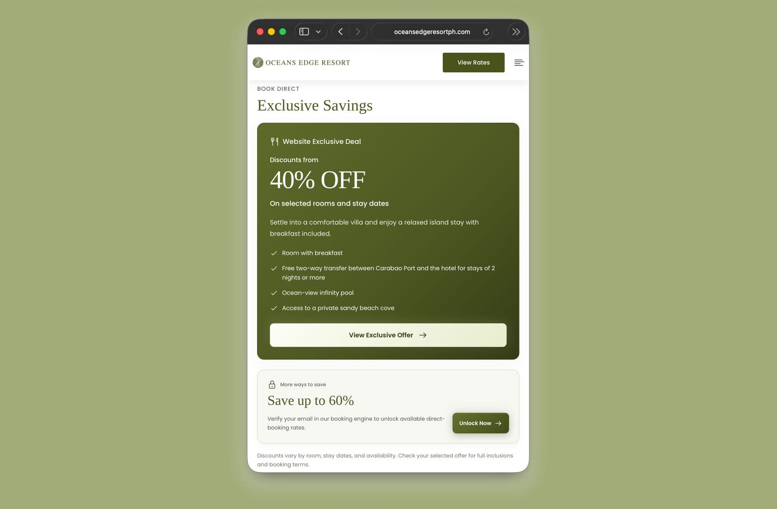
The main website-exclusive offer receives the strongest visual emphasis, with its inclusions and booking action grouped inside one card. The additional email-unlock offer appears as a smaller, secondary option below it.
This arrangement makes the principal promotion easier to identify while giving interested guests another benefit to explore.
5. Organizing the Island Experience
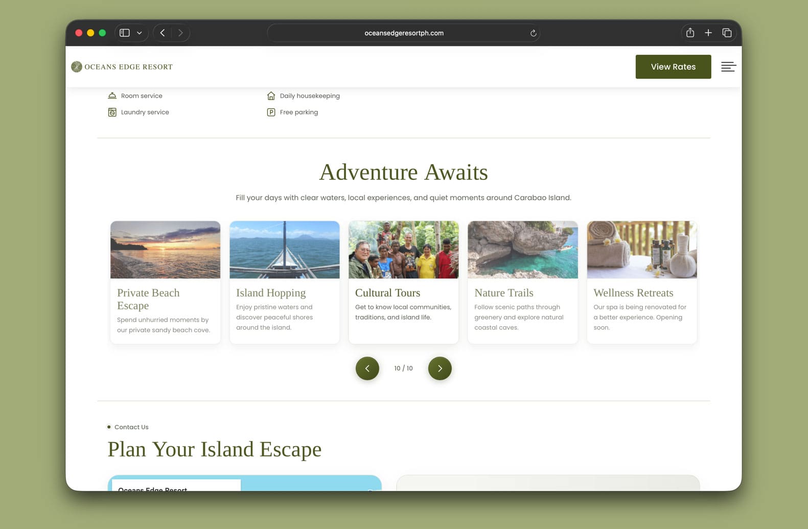
We brought activities into a consistent carousel, pairing photographs with short descriptions of experiences around the resort and Carabao Island.
The section helps guests picture how they could spend their stay, from island exploration and snorkeling to sunset viewing and time by the pool.
We also retained a clear availability notice for the wellness offering, distinguishing an upcoming facility from experiences guests can currently enjoy.
Each detail contributes to a more useful picture of the stay before a guest makes a reservation.
“Every section needed to help a guest understand the stay, make a decision, or take the next step.”
6. Connecting Location, Directions, and Reservations
Clear arrival information matters when guests are considering an island property.
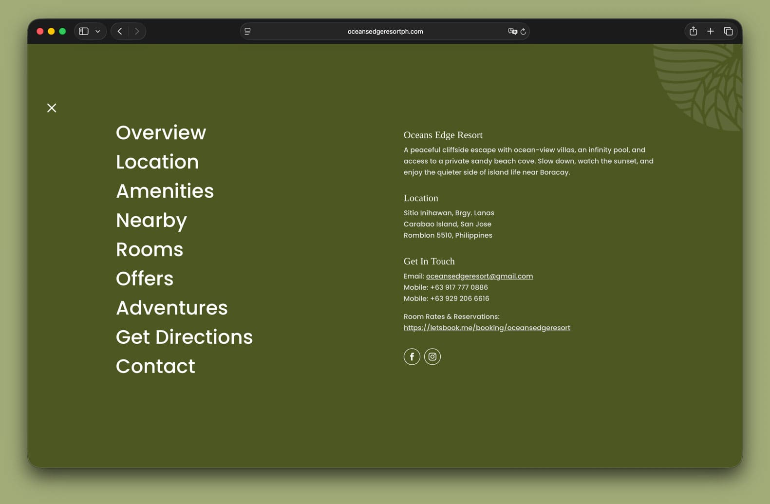
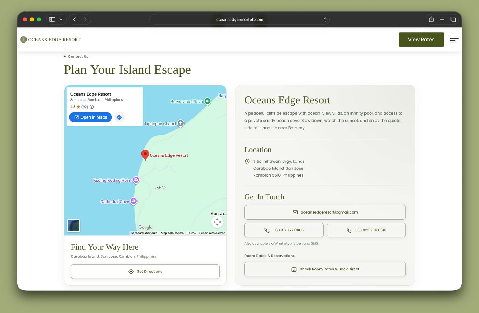
We paired an embedded map with a directions button and a matching information panel containing the resort’s address, contact options, and reservation link.
Travel context also appears earlier in the page, helping visitors understand the location before they reach the contact section.
The arrangement reflects our wider approach to the redesign: consider where a guest may need help, then place the relevant information and next action within easy reach.
The Outcome
The redesigned Oceans Edge Resort website brings the essentials of planning a stay into one thoughtfully organized page.
Repeated information has been consolidated, villa details are easier to compare, and direct booking offers sit alongside the accommodation. Activities, directions, and contact options complete the journey.
Behind the layout is a process informed by real guest conversations and experience in hotel operations. The questions we encountered through Messenger helped us consider what visitors would need from the website before reaching out.
For Oceans Edge Resort, the result is a connected introduction to the property, with practical information organized around the decisions guests make before booking.
OLWC helped us improve a website we hadn’t considered updating. Their process was straightforward, and the update came just in time to support our peak-season bookings.
